Jordan Schnarr | UX/UI Designer
Jordan Schnarr | UX/UI Designer
As my first project at Kenvue, then a part of Johnson & Johnson, I led the revamp of the Benadryl website, which suffered from outdated design, poor branding, ineffective user experience, and disorganized content. Leveraging Johnson & Johnson's 1.0 website templates, grounded in consumer research, the initiative focused on creating a new site map and reconfiguring content to better align with consumer needs and enhance overall usability.
Prior to 2022, the Benadryl website faced significant challenges that hindered its effectiveness and user experience. The site suffered from several critical issues:
Our mission was to address these shortcomings by revamping the website to improve accessibility, usability, and clarity, ensuring a seamless and inclusive experience for all users.
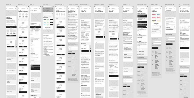
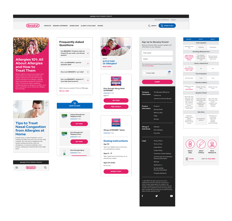
To revamp the Benadryl website, we started with page templates developed by the UX team before I joined Kenvue. These templates provided a clear navigation structure with sections for Home, Products, Learn, About, Contact, and Where to Buy. High-fidelity wireframes, created by the lead designer, brought the templates to life. Benadryl was the first brand to use these templates, which were designed to help users easily find the information they needed, addressing the previous site's issues.
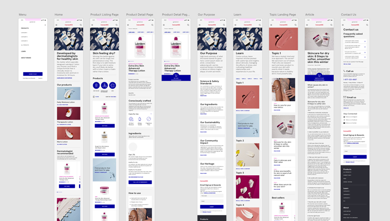
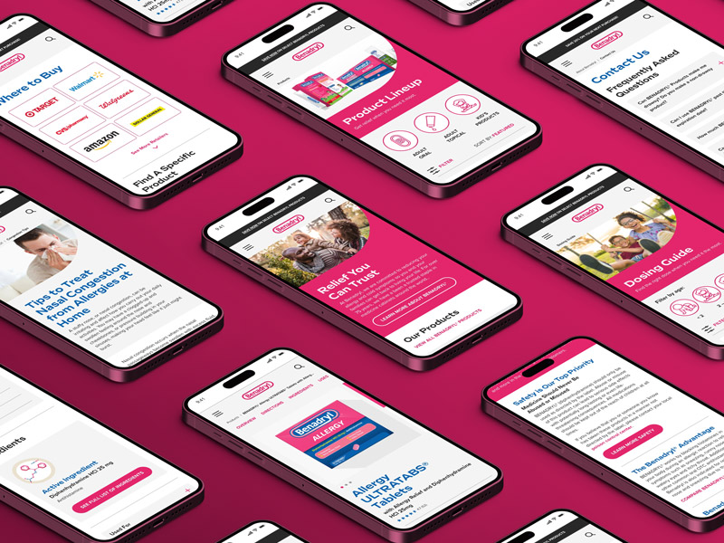
Several pages were redesigned, while new ones were added to better serve users. The homepage was revamped to prominently feature product categories, best-selling products, educational content on allergy topics, and quick access to FAQs. Recognizing that "Benadryl Dosing" was a top search term, we created a dedicated dosing guide page, consolidating all dosing information for each product and allowing users to filter by age or product type for easy navigation. These thoughtfully designed wireframes streamlined the process of applying the Benadryl theme in the subsequent development phase.
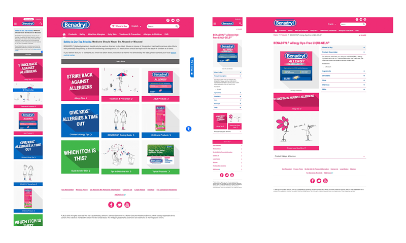
The final phase of the Benadryl website revamp involved applying theming components to the wireframes, enabling seamless content interchangeability once styles were attached. To ensure accessibility, all interactive and text colors were designed to meet a minimum 4.5:1 color contrast ratio, while other colors adhered to a 3:1 contrast ratio minimum. At the brand's request, Benadryl's signature pink was prominently featured, though it was slightly darkened to comply with the 4.5:1 contrast ratio against white or with white text. Grey, white, and blue were incorporated as additional brand colors to complement the theme and maintain visual consistency.
With nearly 90% of Kenvue brand consumers engaging through mobile devices, we prioritized a mobile-first design approach to ensure a seamless and intuitive experience. To give the site a more modern and streamlined look, we introduced a flat version of the Benadryl logo that complements the updated design direction. Additionally, we incorporated fully rounded corners across many key elements, drawing inspiration from the recognizable shape of the Benadryl pill, creating a cohesive visual identity that feels both fresh and brand-authentic.